Tasca Viva
Rustic surrounds, vibrant activity and energetic individuality form the basis of this identity package for Tasca Viva Restaurant Tapas Bar. Tasca Viva is Spanish for energetic place. The word marque is hand-made and rustic with individual flavour. It is immediately Spanish and friendly which matches the interior. A series of rustic shapes based on the patterning in tiles and on a matador's jacket create a subtle backdrop for the identity. A lively wallpaper bringing happy bustling people into the space finishes off the vibe. Spanish inspired characters adorn the toilet doors inviting you to be relieved.
Photographer: James Knowler
UniSA MORF Book
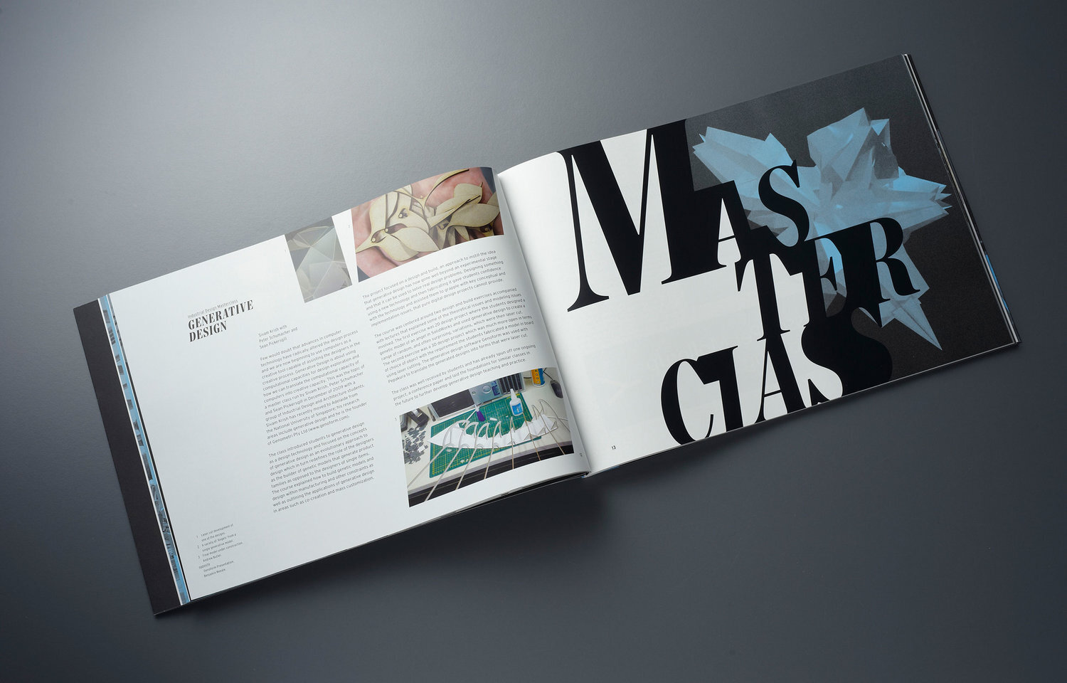
The MORF book was created for the Art, Architecture and Design School at the University of South Australia. The design concept incorporated morphing letterforms that merge and break apart into the page, forming new and unusual negative shapes. Strange forms, still legible, create the starting point for the structure of the body text. Slanted body text makes for unexpected page layouts and an interesting read.
Photographer: Evolved Images
Abstract Nature
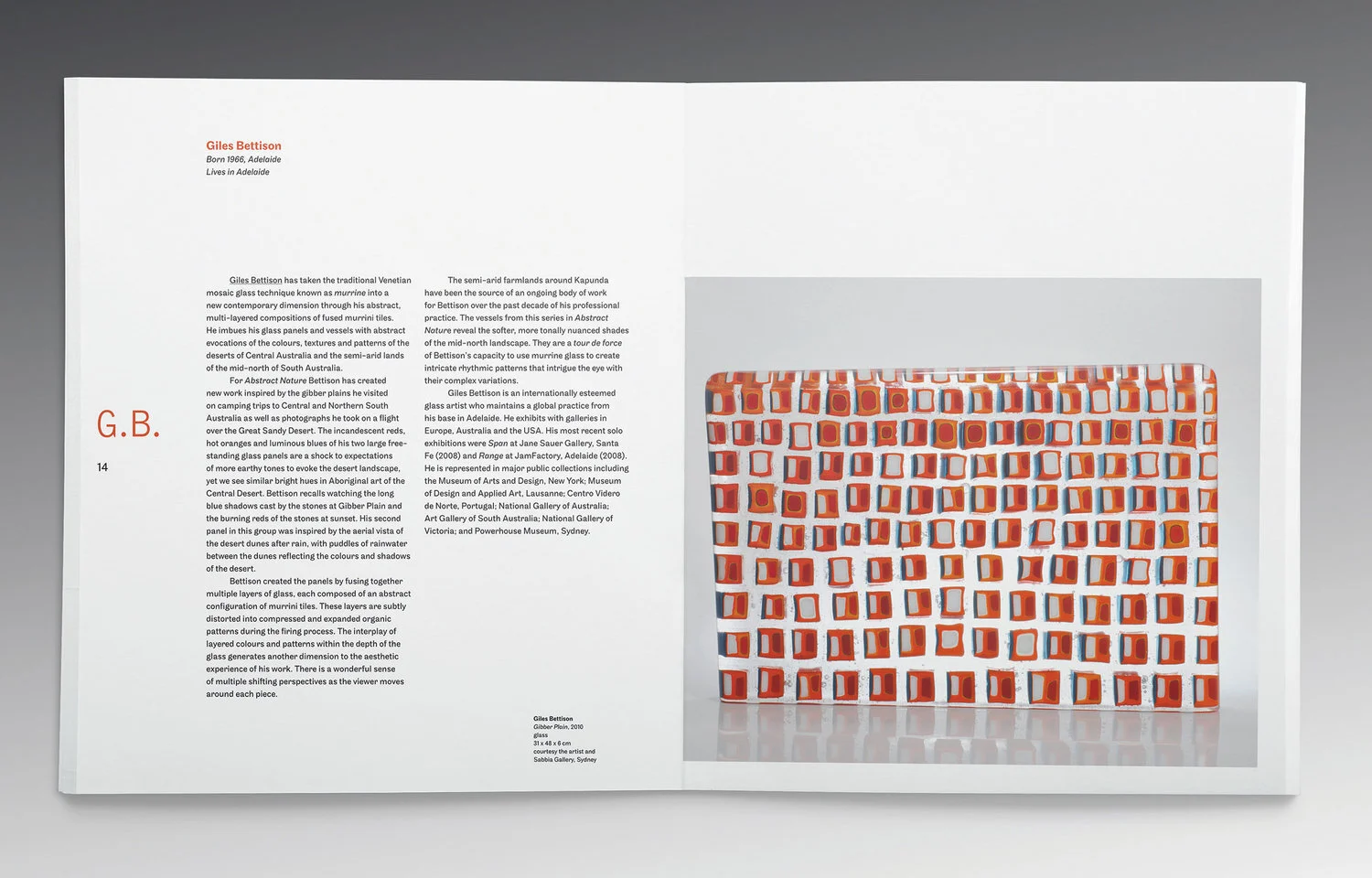
The Abstract Nature Catalogue was created for the Samstag Museum's print and online applications. Clean typography and a simple design structure were utilised for maximum legibility. A design grid, with the flexibility to accommodate different sized images and varying amounts of body text, was used. On the left page of each spread, the artist's initials were placed in large type, for easy navigation through the catalogue's pages.
Award: Highly Commended, Museums Australia Multimedia and Publication Design Award 2011
Pasta Deli
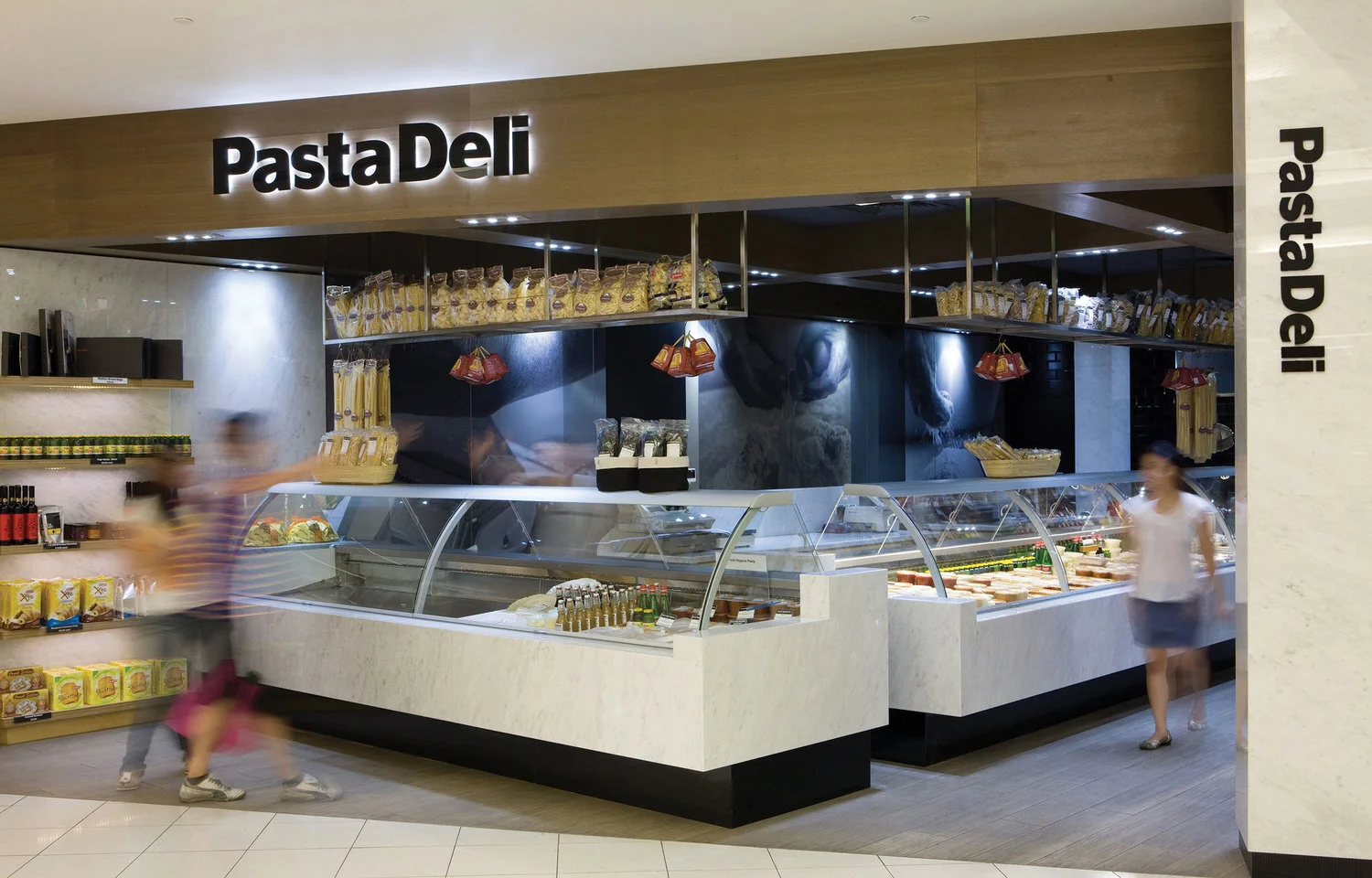
To match the contemporary classic interior a simple typographic identity was developed. The letter forms were altered to create a new typographic personality unique to Pasta Deli. Photographs of the pasta making process were commissioned and used throughout the space. A warm colour was added to these images to add depth and sophistication. Packaging and support graphics have a clean and simple appeal.
Photographer: James Knowler
Barossa Vines Prospectus
The Barossa Vines logo incorporates a vine leaf. Using this as a visual cue a contemporary geometric leaf graphic was developed for the Prospectus. The diagonal lines that emanate from within the leaf gives the Prospectus visual interest and works well in financial tables. The geometric leaf also helped make great abstract image shapes.
Photographer: Evolved ImagesCas
Decant Branding
The client requested a classic, stylish and high end dining experience to entice house guests and the general public. With its use of marbles, luxury eco veneers, Missoni fabrics and Tom Dixon lighting, the intimate restaurant provides a perfect backdrop to fine dining and a high end wine list.
Photographer: Evolved Images
Fox Creek Womad 08
The Get Foxy foxes were developed as fun and exuberant imagery to be used when Fox Creek Wines supports or sponsors an event. The foxes are easy to connect with as they behave just like humans. The foxes were first used at Womadelaide in 2008.
Photographer: Evolved Images
UniSA Exhibition 08
This booklet was created for Architect students and Interior Architect students completing their studies at the University of South Australia. The booklet is a showcase of student work and the courses themselves and helps give the students exposure to exhibition goers. The graphic treatment of overlapping skewed rectangles represents pathways from the past and into the future.
Belair Hotel
The original Belair Hotel was built with Art Deco styling. The typography for the identity takes from this period. Organic tendrils wind their way through the letters of the identity and throughout the internal spaces. In the Bistro mural, forest animals hide amongst the trees. The animals become the theme for stories and illustrations created for the Den bar. The illustrations and mural elements find their way onto coasters and menus.
Photographer: Evolved Images
UniSA Masterclass
The UniSA Masterclasses were a series of professional development classes for practicing designers held by masters of design. The core imagery was developed as a series of bust statues with amazing creative ideas streaming from their minds. Each master of design was allocated a motivational phrase like 'inspire innovation' or 'provoke thought'. This core imagery was used on posters and on a booking website.
UniSA Form3 Book
Form3 is the end of year publication for the Louis Laybourne Smith School of Architecture and Design at the University of South Australia. Deconstructing letterforms facilitate the concept of learning design. A structured yet flexible design grid allows for variation in the quantity and the type of information.
Photographer: Evolved Images
Award: Commendation – Visual Communication, South Australian Design Awards 2009
UniSA ID Program
Using the styles created for the Form3 Book for Louis Laybourne Smith School of Architecture and Design at the University of South Australia, the Industrial Design Program was produced. This program needed to clarify what subjects were included in the course and how many units each subject had, so detailed information graphics were created. These tables/graphs indicated pathways through the course and how many units electives used.
Photographer: Evolved Images
Picnic at Connies
Picnic at Connie's is a rustic after work meeting place out-doors where wood oven pizza and home made beer can be consumed. Created to encourage creative thinking and collaboration. There might be poetry one night and the launch of an unheard band the next. The identity incorporates an ant and subtle pizza shapes. Ants are always an uninvited guest at picnics, but here even the ants are invited. Everyone is welcome at Picnic at Connie's.
Illustrations: Danny Snell
Photographer: Evolved Images
Forestry SA
With a complex system of meeting rooms and internal glass walls, the Forestry SA site required screening for privacy. Forest imagery depicting the growth of a forest, from seed to sapling to mature tree, was developed. The imagery was printed on clear vinyl and applied to internal glass walls, partially obscuring the people meeting inside. Silver plaques were developed to name each meeting room. A cross-section of a tree became the graphic carrying the names of each room.
Photographer: Evolved Images
Safe Kitchen Design Manual
This manual was produced to be a companion for interior architects and architects while designing commercial kitchens. A side margin was created big enough to carry information from various building codes and standards so that more information could be sourced easily. The page numbering includes the section number making it easy to flick to information quickly. A character was created to help communicate the importance of the manual and make the 'dry' content more palatable and fun to read.
Photographer: Evolved Images
Therapia Branding
The Therapia Tree symbolises firm foundations, balance and an ability to be flexible to reach out and be active. The idea behind the logo is that of the Tree-of-Life. Therapia - a healing centre that promotes 'getting the most out of life'. The idea grew in strength by the memory of lying beneath a tree and gazing up at the foliage above in a state of relaxation. By working with Therapia a client can experience all of these physical benefits. A series of photographic and illustrative elements carry through forming a strong identity.


